illustration

Napoléon Bonaparte riding a cow? (part 2 of 3)

Almost completed the Napoléon figure, technically: blocking colours and rendering up to a point: here comes the cow!

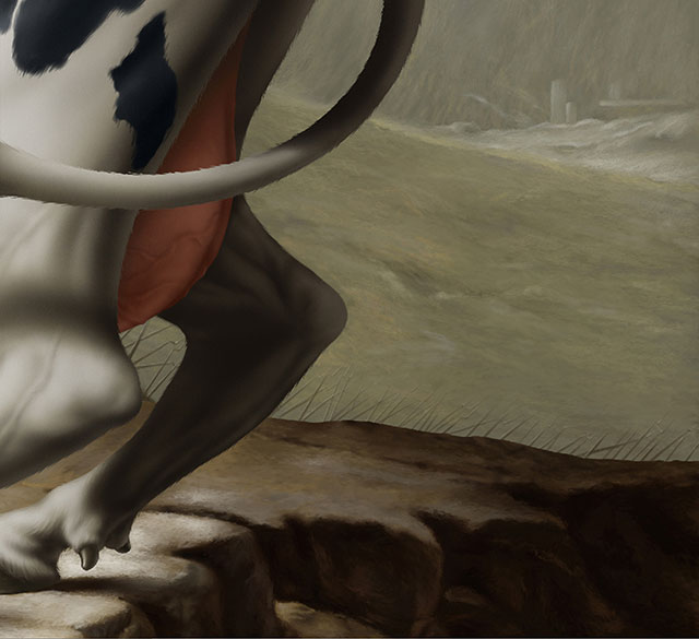
Keeping in mind that the client wanted the cow to be painted like the original painting of the horse ; but they wanted the muscularity of the cow to be toned down.

step2_01_illustration_napoleon_cow_milot

step2_02_illustration_napoleon_cow_milot

I should also point out that a cow does not move like a horse (duh!): as most people know! The requirement to match the pose of the horse from the original painting by David, was a tricky step in the process: getting a pose that was realistic and believable was solve with a bit of creative licence…

step2_03_illustration_napoleon_cow_milot

step2_04_illustration_napoleon_cow_milot

Because this image was going to be used for different formats (bus shelters, posters, etc): there were more “paint” added all around, compare to the original painting by  Jacques-Louis David. Keeping in mind that I had to match the extra painting had to look: as if it was just like the original painting.

step2_05_illustration_napoleon_cow_milot

step2_06_illustration_napoleon_cow_milot

step2_07_illustration_napoleon_cow_milot

step2_08_illustration_napoleon_cow_milot

step2_09_illustration_napoleon_cow_milot

Because most of us look at paintings like the original by  Jacques-Louis David’s Napoléon,  identifying with the major theme: in this case: Napoléon Bonaparte on his horse: when you have to “duplicate” the painting like this project dictated: you start discovering all these elements in the background that otherwise would not have grabbed you initial perception of the image.

step2_10_illustration_napoleon_cow_milot

Next step: completing that background…!


Napoléon Bonaparte riding a cow? (part 1 of 3)

At the risk of repeating myself: I love being a freelance illustrator: you never know what job comes your way when the phone rings. It makes it always interesting.

I received a call to make a poster for a show for the Field Museum of Natural History, in Chicago,  about an upcoming show based on the crucial importance that the horse had throughout history. What they wanted me to do: was to duplicate (a polite way of saying: copy) an existing painting with a twist!

As a rule, I am never to thrilled to paint like someone else! As a painting exercise I have done it in the past, and was often asked to paint in the “style of”. In this case it was a challenge and a fun conceptual twist from the original.

The Field Museum wanted me to paint: Napoleon Crossing the Alps (also known as Napoleon at the Saint-Bernard Pass or Bonaparte Crossing the Alps), by french painter: Jacques-Louis David (30 August 1748 – 29 December 1825).

rene_milot_illustration_art_napoleon

Painted between 1801 and 1805, there are 5 versions that Jacque-Louis David painted in the neoclassical style.

After the Field Museum acquired the proper rights, they wanted me to replace the horse for a cow! We also had to decide: which of the five versions we should go for!

jacques_louis_david_napoleon

As if that was not enough: we had to make the final image fit for billboards, posters, bus shelters, etc. That’s why the sketches have “more meat” on the edges to fit all the information for the show.

sketch_01_illustration_napoleon_milotsketch_02_illustration_napoleon_rene_milot

The first sketch was deemed too muscular (the cow), so I toned down the muscles. As a painting: there was so many challenges to tackle: first of course: it had to look like the original painting like David, and because I had seen one of the versions in person: I knew how I had to paint it but also knew how challenging to paint it.

step_01_illustration_napoleon_rene_milot

step_02_illustration_napoleon_rene_milot

So by just blocking colours and rendering up to a point: I knew I had to come back at the end to add all the brush strokes, later on in the process; to match the real painting.

step_03_illustration_napoleon_rene_milot

step_04_illustration_napoleon_rene_milot

Even the fact that I had a reference of the actual painting to work from: there was a lot of information that I had to decipher!

step_05_illustration_napoleon_rene_milot

step_06_illustration_napoleon_rene_milotstep_07_illustration_napoleon_rene_milot

step_08_illustration_napoleon_rene_milot

Well on it’s way, trying to match brush strokes as much as I can:  the base is almost there: the difficult part was the size of the artwork: because it was going to be seen so closely by the public: bus shelters, etc: it made the process tricky and I was glad the Mac computer had plenty of RAM and Corel Painter was stable!


CAN YOU PAINT INVISIBLE PEOPLE ? The Secret Sherry Society: the socialite. PART 3 of 3

The last illustration for the Secret Sherry Society: the socialite. Keeping with the concepts of the previous two illustrations: throw in an invisible person and let their clothing and accessories describe them. Please note that no animals were hurt in the making of this painting.

Meet the socialite:

rene_milot_illustration_painting_art_socialite

From the simple sketch, I knew where I wanted to go with this illustration: in this project: I twisted things around: using the figure to create some dynamic instead of using the background. That way I solved the issue of the different elements would not be lost within the composition if the figure pose was too static!

1_step_sketch_blog_illustration_rene_milot

Let’s get started with the fox: this project threw my normal completion process: since there was no figure to paint first; to set the tone of the illustration: I have to rely on all the elements to do that!

1_step_blog_illustration_rene_milot

Then the dress.

2_step_blog_illustration_rene_milot

It needed some patterns on that dress: I started with small regular patterns: it screamed bold and irregular. Then of course because I never make life easy for myself: so I added some lace long gloves: did I ever regret that choice: it took for ever to render.

5_step_blog_illustration_rene_milot

6_step_blog_illustration_rene_milot

The original sketch had the invisible socialite wearing sunglasses: would have been totally funky: but they removed them: so  we were left with the hat only.

4_step_blog_illustration_rene_milot

From the sketch stage: I knew I wanted some funky striped wallpaper in the background with wonky colours in order to stand out differently than the previous two illustrations.

3_step_blog_illustration_rene_milot

I have to say, that these 3 illustrations were a blast to paint and the creative team that I worked with were great fit. Thanks for the opportunity to have so much fun.


CAN YOU PAINT INVISIBLE PEOPLE ? The Secret Sherry Society: the aviator. PART 2 of 3

For the second poster for the Secret Sherry Society, the Aviator was a lot of fun, just like the previous illustration concept: the country gentlemen: this one had elements that made it too much fun.

9rene_milot_illustration_art_aviator

Just like all my project: minimum information in my sketch: so I can have fun in the final illustration!

1a_step_blog_drawing_illustration_rene_milot

Blocking colours to guide me a bit for the colour choices: honestly: I really never plan my colours: I love the challenge of choosing and tweaking the colours on the fly: makes the process more challenging.

1_step_blog_drawing_illustration_rene_milot

Let’s dress this lady: the boots!

2_step_blog_drawing_illustration_rene_milot

Then the blouse and scarf.

3_step_blog_drawing_illustration_rene_milot

Finishing the jodhpurs.

4_step_blog_drawing_illustration_rene_milot

I can’t take the credit for the “animal” the agency wanted: it was their choice: totally funky: I loved it!

5_step_blog_drawing_illustration_rene_milot

The concept behind all the illustrations was to have a seemingly normal portraiture with weird elements to keep the viewer interested: this is my preferred way of working: the image has to catch you once  and maintaining the curiosity level by these small details.

The first version had just a rusted metal background: so just before the delivery of the illustration: I opted for a hangar door (keeping with the theme: aviator) and added the shadows to shake the stillness of the pose.

6_step_blog_drawing_illustration_rene_milot

The agency insisted with glasses on top of the head of the invisible aviator: they wanted some “Ray Ban” like the movie “Top Guns”, I was not in agreement with that decision.

7_step_blog_drawing_illustration_rene_milot

After discussions: I suggested the older bomber style goggles. At the end: we all agreed that it was a better fit.

8_step_blog_drawing_illustration_rene_milot

CAN YOU PAINT INVISIBLE PEOPLE ? The Secret Sherry Society: the country gentleman. PART 1 of 3

What I love about being a freelance illustrator, is that you never know what type of project is coming your way when you pick up the phone. Sometimes you get a great project to work on with a great creative team.

Contacted by an ad agency from Seattle, the art director (Kristi Flango) laid it on me: we’d like you to paint “invisible people” for a series of posters for the Secret Sherry Society. What a cool concept and the illustrations were going to be fun to do: no matter what!

The idea was to depict fictitious quirky Secret Sherry Society members while keeping their anonymity; identifying them only with their clothing in a fun way: at first glance they appear normal with a few funky elements.

Here is the country gentleman!

country_english_gentlemen_invisible_sherry_concept_milot


As always, I do not spend too much time on the sketch: it’s for client’s approval. The energy is spent of the execution.

sketch_country_gentleman_sherry_society_milot

The rendering starts, step 1; blocking areas to know where I’m heading.

step_1_country_gentleman_art_milot

Step 2, just pushing it a bit further:

step_2_country_gentleman_art_milot


Cleaning up the pocket watch chain fob.

step_3_country_gentleman_art_milot

Tweak the narwhal walking stick.

step_4_country_gentleman_art_milot

Here are some close up of details of the completed illustration. Adding a sherry glass, wallpaper patterns in the background, textures for the tweed cap and jacket. I wanted to add a monocle: the client did not agree: too bad: I think it would have made the illustration a bit more complete as a concept: win some, loose some.

details_1_country_gentleman_art__illustration_milot


The narwhal walking stick

details_3_country_gentleman_art_narwhal_illustration_milot


As a final touch: for the pocket watch chain with fob: as an added detail for the fob: I incorporated the 3 “s” of the Secret Sherry Society as an engraving.

details_2_country_gentleman_art__illustration_milot

URBAN ANGEL: deconstructed, final part (six)

Here are just some details taken out of the final illustration. As a whole, the image is busy and I just wanted to point out some little touches that I had fun painting: gotta have fun. details1_step_blog_painting_illustration_rene_milot details2_step_blog_painting_illustration_rene_milot details3_step_blog_painting_illustration_rene_milot The addition of the feather was just to emphasize in a subtle way, the “angel” part of the concept. details4_step_blog_painting_illustration_rene_milot details5_step_blog_painting_illustration_rene_milot

URBAN ANGEL: deconstructed, part five

The figure almost where I want it to look, it’s time to fit in some elements, to make the eyes move around. The way I approach that entire painting was to have it busy in terms of visual interest (graffitis): to draw the viewer in. I love to add these additional elements, like shadows, pipes and vent (in this case) because I treat them like graphic components, just like chest pieces that you move around, to redirect and balance the painting.

10_step_blog_painting_illustration_rene_milot

URBAN ANGEL: deconstructed, part four

Time to add some tatt’s, cool and graphic element that I’m hoping will add the the figure.

7_step_blog_painting_illustration_rene_milot

In every painting I do, I always try to make the elements fit within some dynamic reason. In this case, playing around with the placement and the way that it wraps on the shoulder, also making sure that the components within the design of the tattoo conform to that dynamic unity.

8_step_blog_painting_illustration_rene_milot

The final tweaks to incorporate it to the figure.

9_step_blog_painting_illustration_rene_milot

It has to fit within the painting, as a supporting role.

URBAN ANGEL: deconstructed, part three

I love painting figures, it anchors the image and translates the message. With a few variation of tones and values: it changes everything. It’s also cool the see a person emerges from a blank page.

4_step_blog_painting_illustration_rene_milot

I use photo references whenever I can: the reason is simple: getting to the wanted result faster. I deviate a lot from the pictures I take, because I want the figure to be my own: at least with a reference, I do not get stuck, painting a stupid elbow for half a day. Those who have the time and better abilities to do it all without references: good for them, for me, as a commercial artist: the deadline is always looming. Also I have not yet met a model that will pose for a few hours in the studio. (I’m also taking this opportunity to thank all my friends and family that have generously posed for me for years)

5_step_blog_painting_illustration_rene_milot

Almost there, just a few more touches.

6_step_blog_painting_illustration_rene_milot

URBAN ANGEL: deconstructed, part two

Now that the drawing is established: the fun part starts: adding colour. Placing what has been done so far, time to assemble and tweak to fit.

2_step_blog_drawing_illustration_rene_milot

Because I started this project differently than my usual way of painting: using tones, then placing colours underneath: it will require a bit of adjustments to make it fit within my background.

3_step_blog_drawing_illustration_rene_milot

I’m sad to say that I went a bit overboard painting the background: I chose to go the long way. Did all the textures, as a challenge, just wanted to to make it all from scratch: I have different brushes and some that I have created in Painter and Photoshop, it took way longer than I expected.